Fitted
Fitted
Fitted
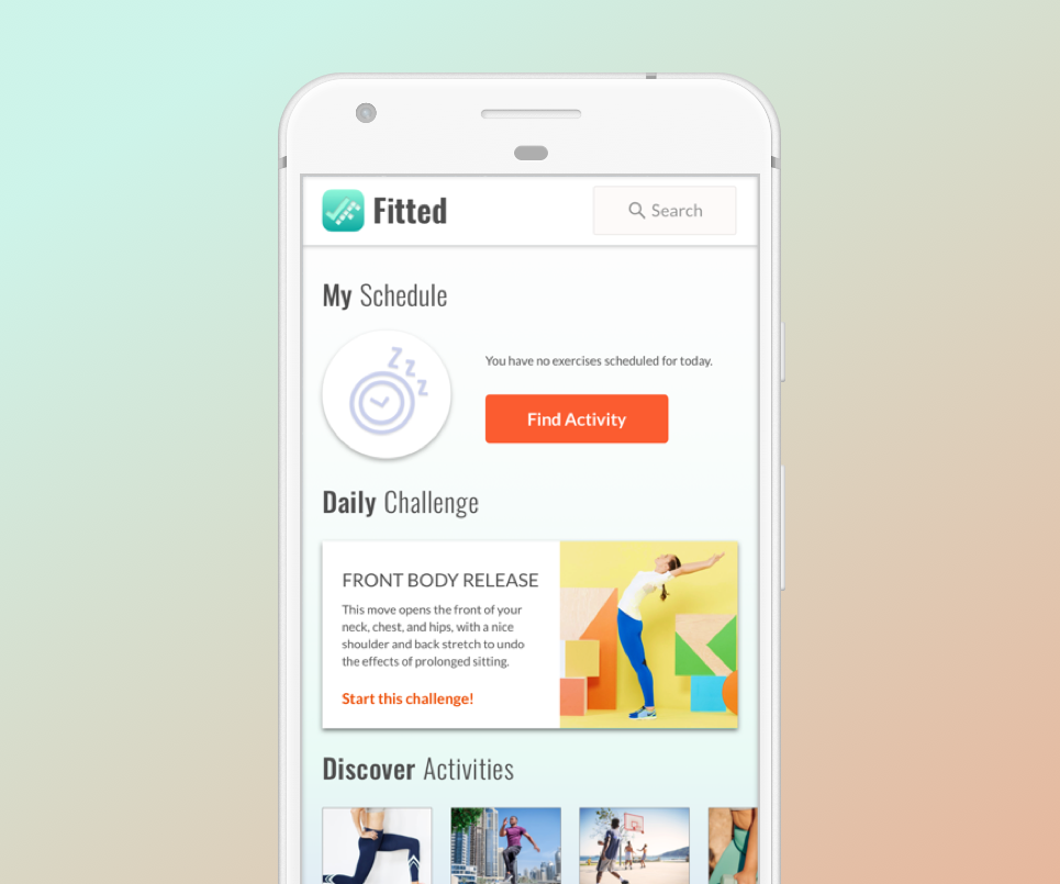
A motivational fitness tool that helps people find an exercise routine that suits their level, schedule, and interests.
A motivational fitness tool that helps people find an exercise routine that suits their level, schedule, and interests.
A motivational fitness tool that helps people find an exercise routine that suits their level, schedule, and interests.
A motivational fitness tool that helps people find an exercise routine that suits their level, schedule, and interests.
Overview
Overview
Design Challenge
Design Challenge
Design Challenge
As someone who has focused primarily on UX design for the majority of my career, I'd decided to take a course to learn more about UI design. For the course, I was given 3 different prompts for a responsive web app and had to select one to work on. I opted to work on a project called Fitted; the objective for this project was to create an experience that would motivate people into an exercise routine that suits their level, schedule, and interests. The following context was provided:
- The app is geared towards people who are new or returning to fitness
- It's difficult for people who are new to fitness to figure out what kinds of exercises they might enjoy
- It's difficult to find a way to fit exercise into our busy lives.
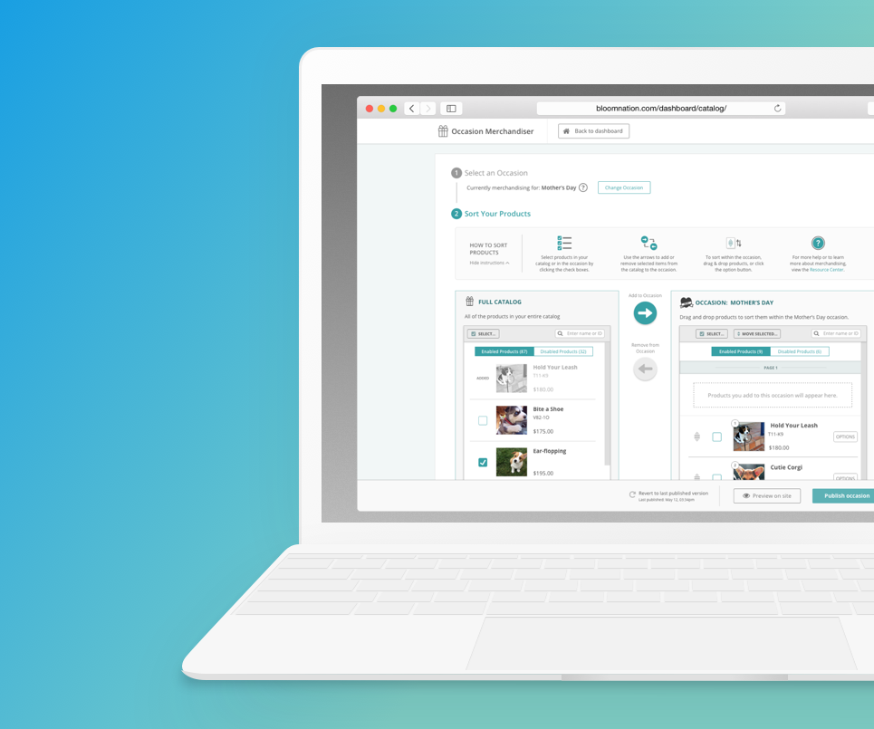
In order to allow florists to show customers the most relevant inventory on their sites, BloomNation wanted to enable its florists to merchandise (i.e. to sort) their inventory based on a specific season, holiday, or event. In addition, this would be the first tool built outside of the existing dashboard system.
Solution
Solution
Solution
I designed an experience that allows users to locate and schedule a variety of easy and beneficial exercises. Users can browse a curated exercise list, learn about different exercises, take a simple quiz that will suggest exercise to try, add activities to their calendar, and see what kind of activities their friends have tried.
Using user research, design intuition, and UX best practices, I designed a new tool for occasion-based merchandising. The tool enables florists to move items from their general catalog into specific occasion buckets. Once in an occasion, they can then further sort their items. They can also easily enable or disable items.
Case Study
UX Process
01. My Role &
Responsibilities
01. My Role & Responsibilities
01. My Role & Responsibilities
As the sole designer for this UI focused project, I was responsible for:
- Conducting comparative/competitive analysis and defining the user journey and workflows
- Creating the visual design, defining the experience's typography, colour, interactions, animation, and branding
- Designing for mobile, tablet, and web breakpoints
As the lead designer for this project, I was responsible for:
- Initial comparative analysis and design research
- Collecting stakeholder feedback during design studios to inform my design decisions
- Mapping out the user journey
- Orchestrating BloomNation’s first ever user-testing sessions. Related tasks include writing a test script, moderating tests, technical setup for tests, taking notes, and preparing a findings document
- Providing all required design deliverables (wireframes, high fidelity mocks, icons, photo assets, etc)
- Pairing with the engineering team to ensure a smooth development and “design QA” process
- Working with a product manager and account managers to develop documentation for the florists
02. Project Rationale
The reason I chose this app is because I personally struggle with finding the motivation to work out. There are hundreds of fitness apps, so I wondered if an app specific to this problem could actually address the issue. The direction I initially planned to take this project in was to:
- focus on scheduling workouts and fitting them into the user’s routine
- reward users by providing silly but addictive badges that encourage them to keep working out while collecting rewards.
Additionally, I also feel the app would do well with official partnerships where people with a certain badge level could get rewards (like a discount on workout gear or healthy foods), but this may also be out of scope.
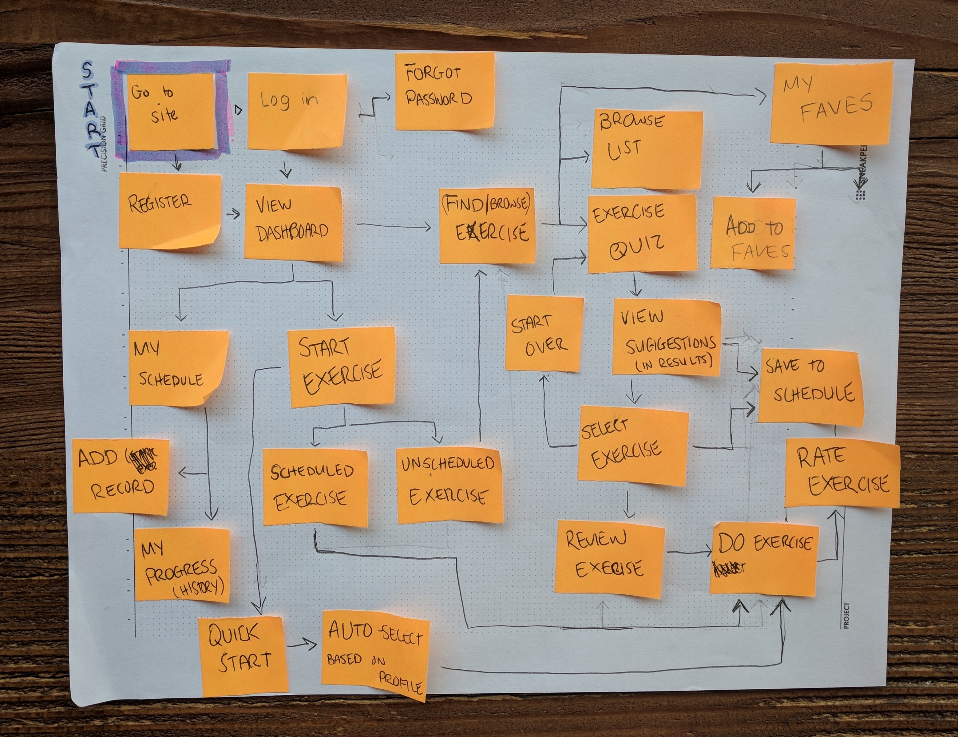
03. User Journey, User Stories, & Lo-fi Wireframe Development
The first step was to define the user journey. I mapped it out with sticky notes:
After mapping out the user journey, I created user flows for the following user stories (user stories were provided in the project brief):
- As a new user, I want to learn about different exercises, so that I can figure out what is best for me.
- As a new user, I want to be shown how the exercises are done, so that I know I’m doing them correctly.
- As a frequent user, I want to be able to schedule exercises for working out, so that I build positive habits.
- As a frequent user, I want to be able to earn achievements or rewards, so that I can stay motivated.
- As a frequent user, I want to complete daily challenges, so that I can have an additional way to stay motivated.
- As a frequent user, I want to track progression and record what I’ve done, so that I can see my progress over time.
- As a frequent user, I want to be able to share routines with my friends who may also be interested, so that I can encourage them to become healthier.
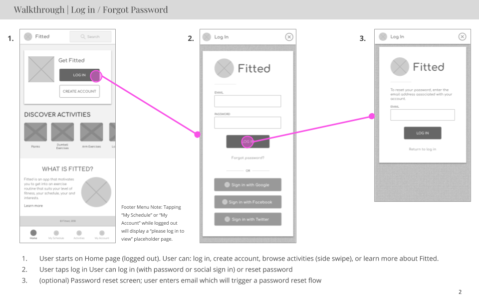
I drew the wireframes for the key screens on paper and assembled a lo-fi prototype, available here (Invision).
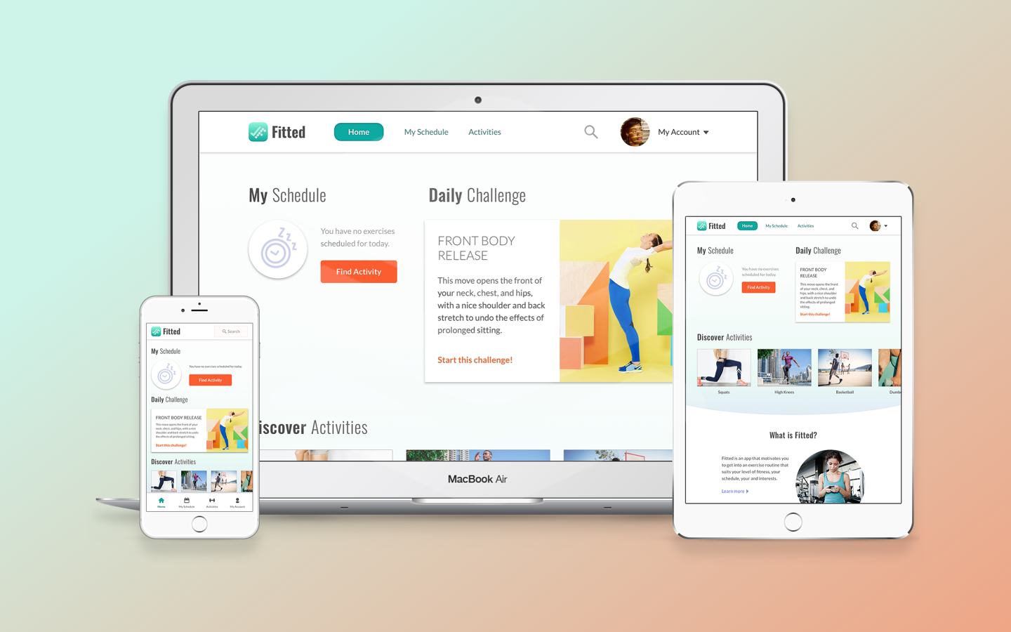
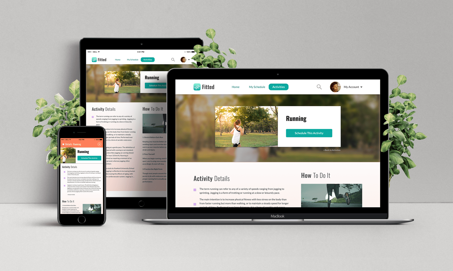
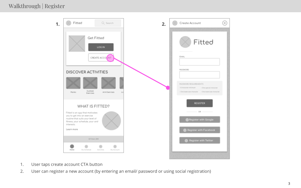
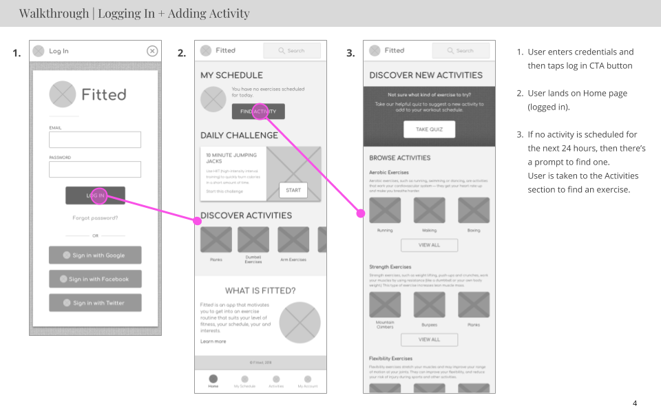
04. Mid-fidelity Wireframes
The next step was to refine the paper lo-fi wires and make digital mid-fidelity wireframes for each of the needed screens. I created several different screens and mapped them together to walk through the various user stories. The following is a small selection of mid-fidelity wireframes:
Interaction & Visual Design
01. Mood Boards
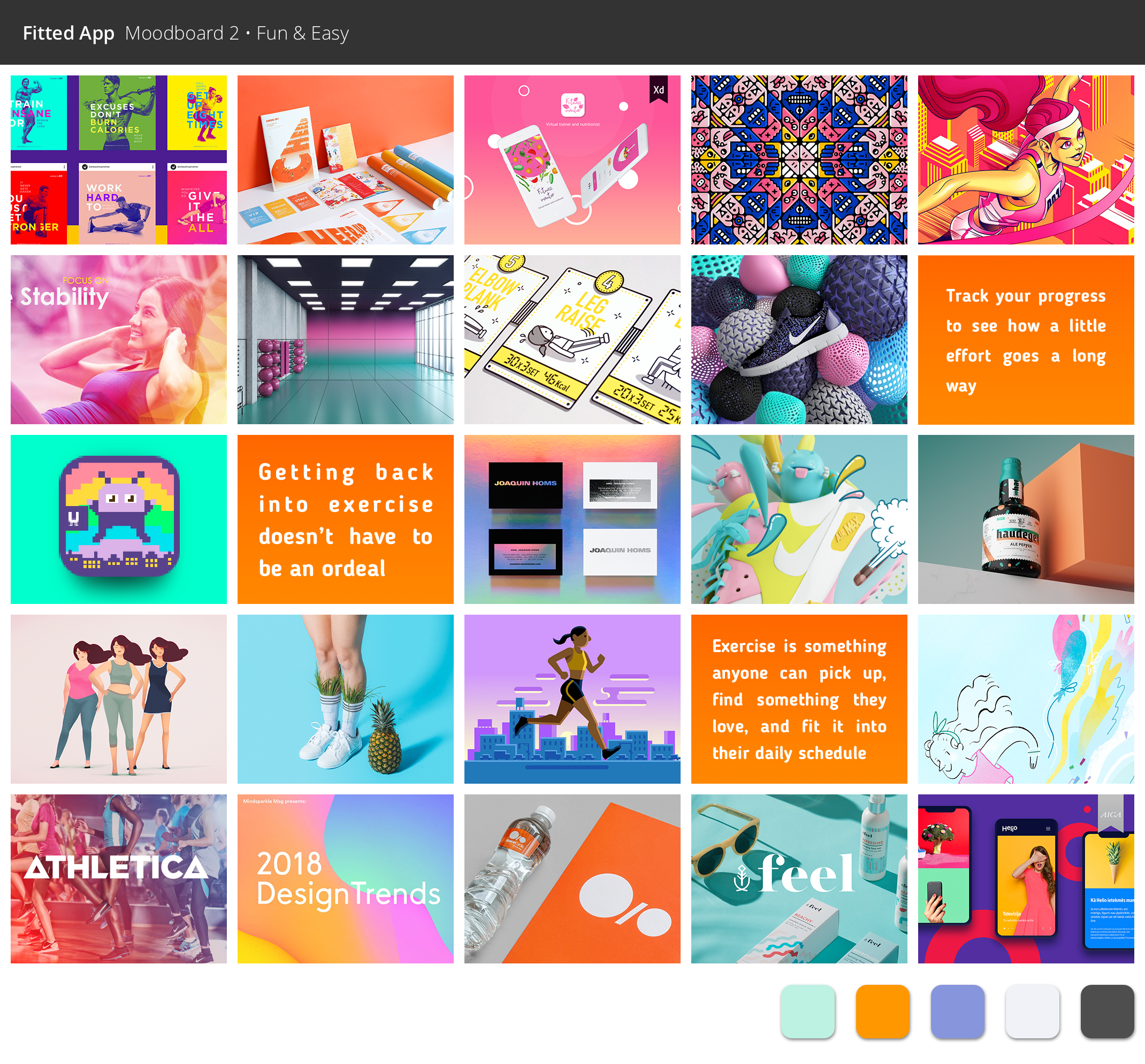
With the lo-fidelity prototype completed, the next stage was to start working on the groundwork for the UI aspects of the project. I started by exploring the visual direction with 2 different mood boards. The first mood board was nicknamed "Sleek & Fit" and the second was "Fun & Easy". I decided to go with Moodboard 2 (Fun & Easy)
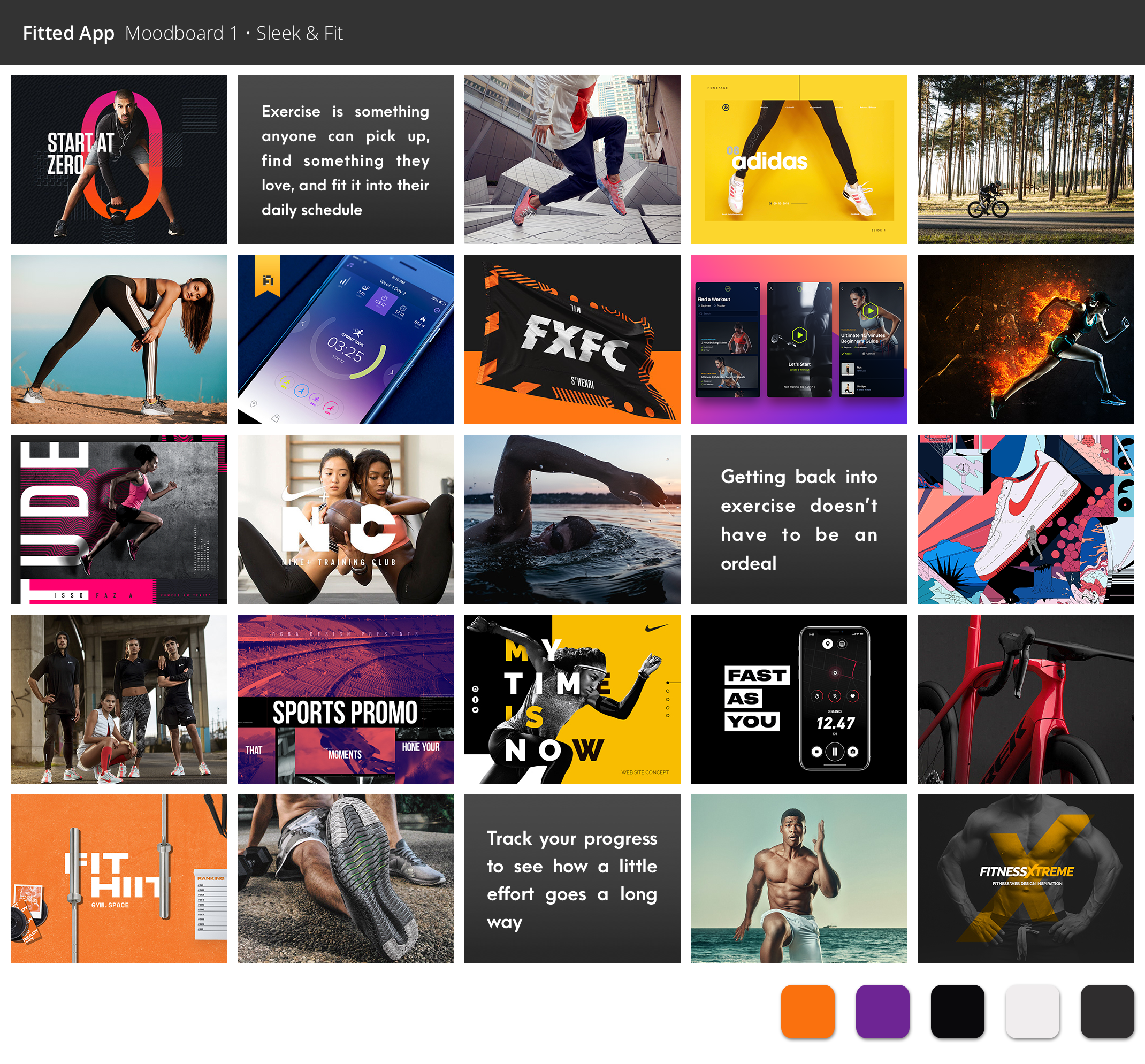
For Mood Board 1, I was inspired by fitness brands like Nike or Adidas. While dark colours and bold accents are often seen in fitness advertising, according to the design brief this app is supposed to appeal to people who want to exercise but don’t know where to begin. Seeing a lot of strong imagery with people who are already in great shape is likely going to be off-putting to a user who is just getting started.
As cool and modern as these fitness ads are, they are almost a little too elitist for the vision I feel this app should have. Focusing on a more friendly and lighthearted concept as opposed to something heavier and more intense will create an app that looks fun and welcoming. To test my assumptions, I checked the mood boards with a few friends. The majority of my friends who are extremely fit and already have established exercise routines preferred Moodboard 1. My friends who described themselves as out of shape or have only recently begun to exercise were more attracted to Moodboard 2
02. Branding & Visual Design
02. Findings & Recommendations
02. Findings & Recommendations
The next step in the process was to start establishing the app's visual details and to work on the brand design. I defined the following:
BRAND PURPOSE
Fitted’s purpose is to provide an experience that motivates people into an exercise routine that suits their level, schedule, and interests.
COMPANY VALUES
We strive to be:
- Simple - easy to understand and use
- Fun - using Fitted shouldn’t feel like an obligation
- Motivational - support our users when they don’t feel like working out
- Flexible - able to seamlessly fit into our users’ lifestyles
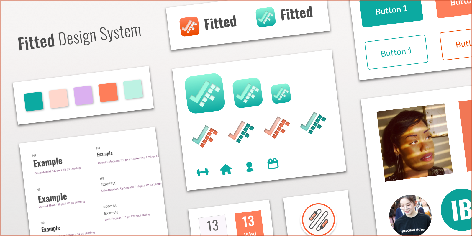
To learn more about the branding choices, view the branding section of Fitted's Design System.
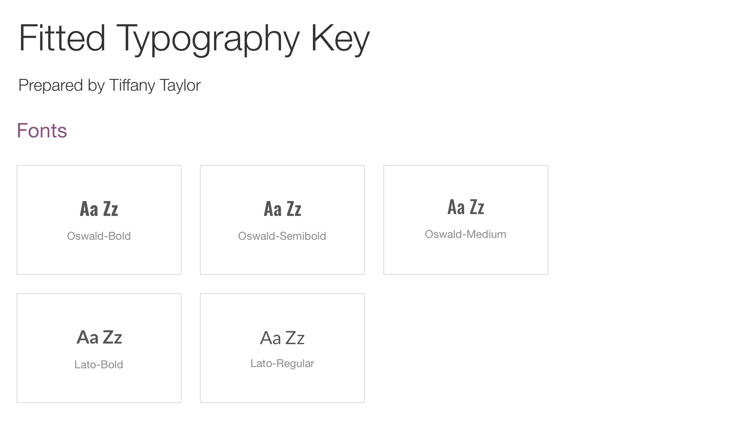
I chose Lato for the body text and Oswald for the headers. I felt Lato was a warm and easy-to-read app, and Oswald added a nice boldness that was not overwhelming.
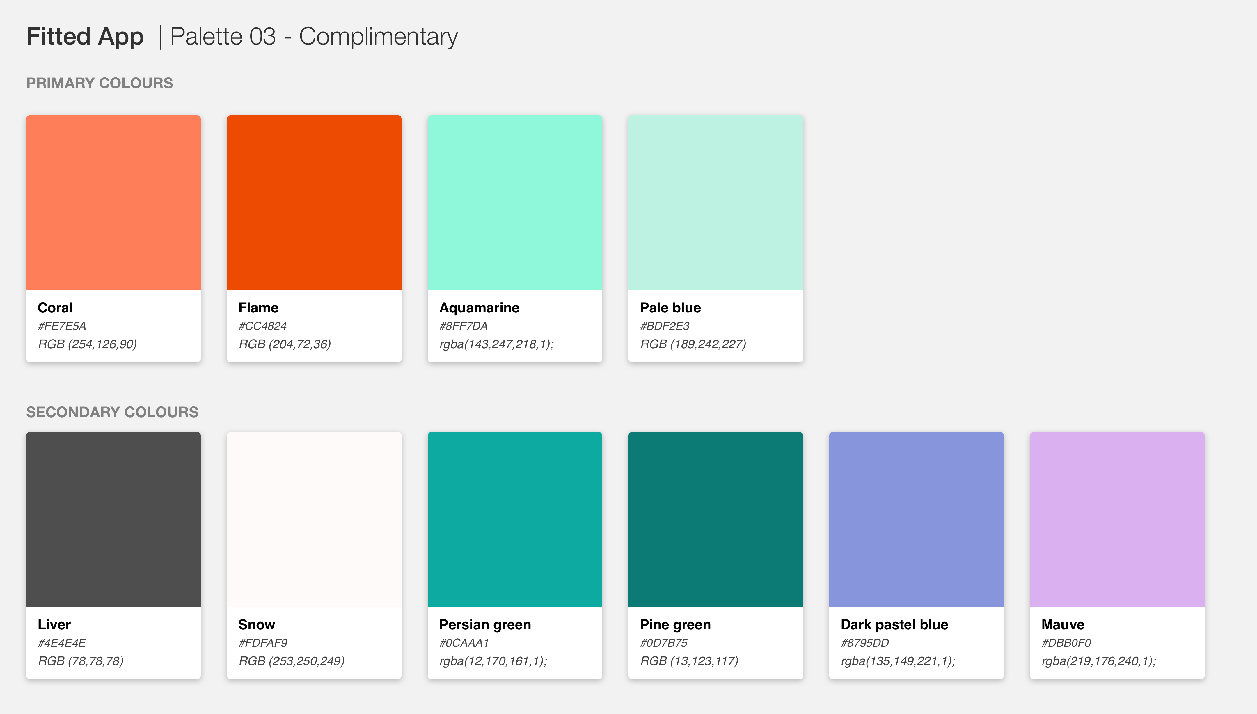
For the colour palette, I relied on my mood board and the project brief. I went with a complementary colour scheme with orange (coral) as the focus colour; the branding guide said to include “orange and black” but because this app is targeting beginners, I felt black was too heavy to be used as the focus colour. The palette has 4 primary colours. The complimentary Coral and Pale Blue, which a darker tone for each of the two hues. The secondary colours are for text, accents, and background use mainly, as well as for tinting or shading the primary colours as needed.
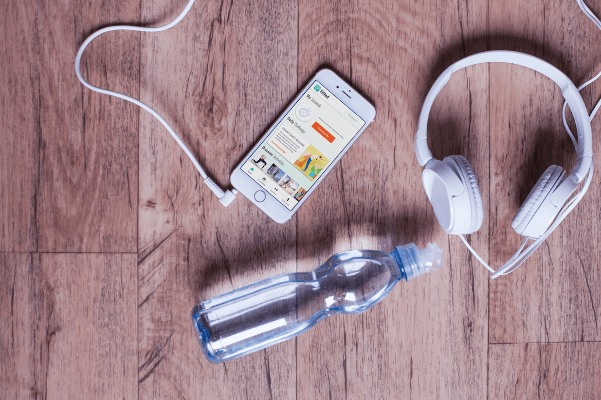
For the imagery in the app, the emotions and feelings I wanted to convey is that it’s still possible to set attainable fitness goals, even if you’re a newbie or unsure. Fitted is here to help anyone struggling with that scenario. These images I would select for my app should show natural looking people in everyday fitness situations. Scenes of people jogging, a gym atmosphere, playing basketball, exercising with friends, and getting fit in local parks are all relatable scenes that convey how easy it can be to work out in a variety of methods.
I also created the icons at this stage. My inspiration for the icon was to use the letter F and incorporate a checkmark. I wanted a checkmark so I could convey the feeling of checking something like exercise off from your daily to-do list.
03. Interactions & Animation
02. Findings & Recommendations
02. Findings & Recommendations
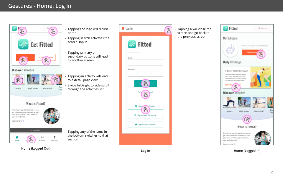
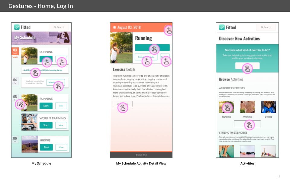
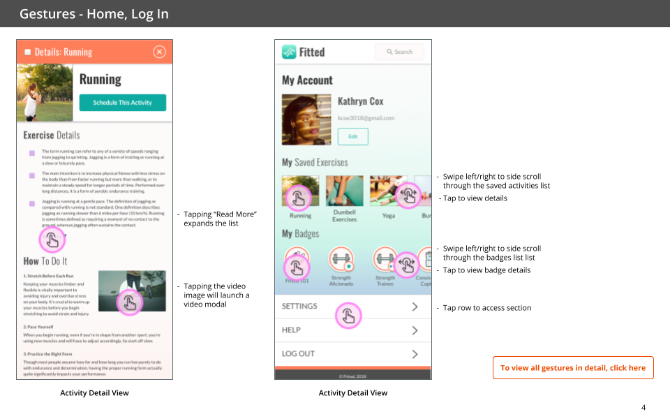
Once the visual foundation was set, I started creating the high fidelity mocks to put in a hi-fidelity prototype. For this step, I had to consider the gestures a mobile user may use while interacting with the app. I created a document to explain how the gestures and other interaction patterns would work.
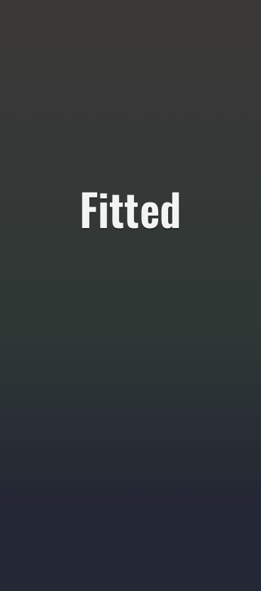
Next, I designed a loading screen. It was my first time working in AfterEffects. I studied animation for a time in college so I was happy to put some of that training to use. Although a loading screen is not something we want users to view for a long period, I wanted to make a simple screen that displayed the Fitted branding.
04. Design System
02. Findings & Recommendations
02. Findings & Recommendations
The next task was creating a design system. The design system will allow Fitted to have a consistent and concise voice across all platforms and screens.
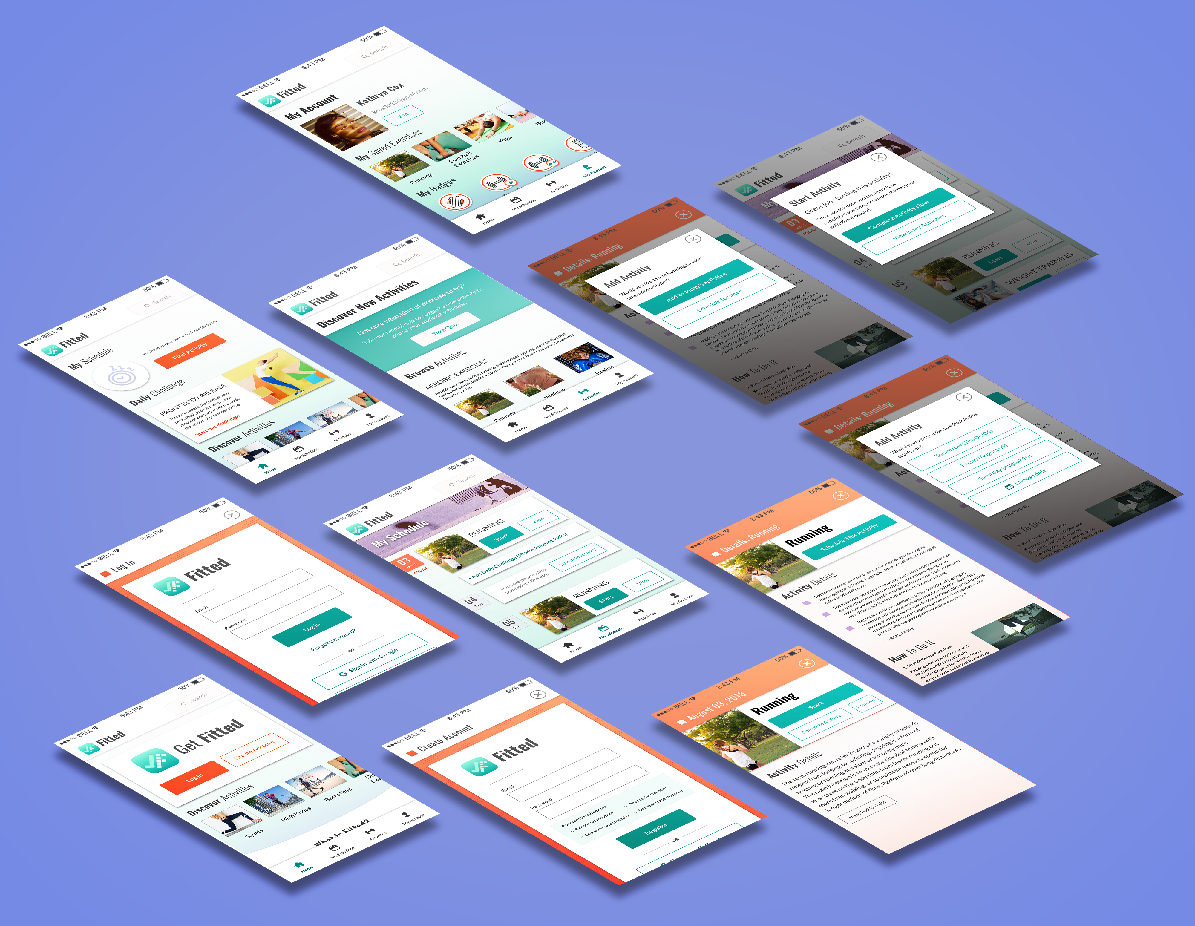
05. UI Prototype
02. Findings & Recommendations
02. Findings & Recommendations
The last part of the course was to assemble the hi-fidelity prototype in Invision.
Reflections
Interaction & Visual Design
This project was completed for a UI design course that lasted about 8 weeks. It was a good experience because I have wanted to learn more about UI design and improve my skills in this area. I learned a lot from the lesson lessons and my course mentor, Matteo. Over the duration of the project, I had a few thoughts about things I wish I could have done differently or things I'd like to change in the future.
- Lack of scheduling, gamification, and social experiences. Due to time constraints, I didn't get to fully design these experiences. Fitted is meant to integrate into people's lives to make it easier to exercise. I really would like to explore how Fitted can integrate with popular calendar apps to automatically populate activities into a user's preferred calendar (similar to how Google Calendar does it). On the user profile, you can see there are badges but there are no screens for how badging works. The social aspect is seen on the activity detail screen with the "friends who tried" section, but there's no explanation of what happens when a user taps or clicks to view a friend's profile. Gamification and a social integration would both allow Fitted to be a very motivational tool by encouraging users to stick with their routines.
- Limited user testing. I quickly tested the lo-fidelity wireframes and imagery, but I did not get to test the more refined designs. Without proper user testing, it's hard to tell how well users can achieve the tasks they want to do while using Fitted.
- App Colour Palette Concerns. I worried that the app felt very feminine. In the project brief, the user we were targeting was a woman, but I would like to test the app's design to see if it appeals to men and non-binary people as well. It's a lifestyle and health/fitness app, but the goal is to be inclusive so I would like to explore the colour and imagery choices to see how well that goal is being achieved.
Selected Works
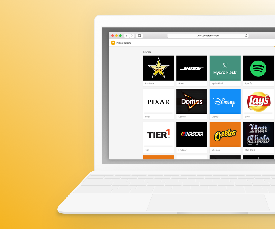
Potion Design SystemProject Overview (Versus Systems)
Platforms DashboardCase Study (Versus System)
Occasion MerchandiserCase Study (BloomNation)
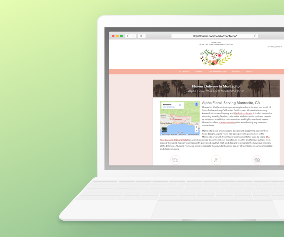
Neighborhood Local PagesCase Study (BloomNation)
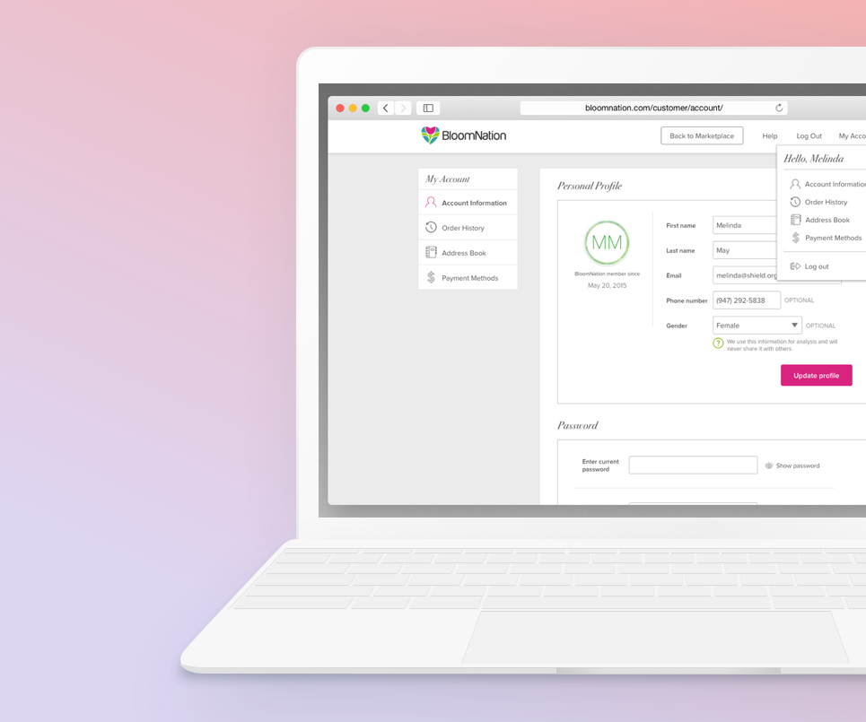
Account ManagementCase Study (BloomNation)
Visual DesignAssorted Projects
Document DefenseProject Overview (Rocket Lawyer)
Selected Projects
Design & code by Tiffany Taylor Lee ⋅ © 2023 ⋅ All Rights Reserved


