Selected visual design elements and interfaces
BloomNation was building a feature that allows a shopper to like products. My only requirements for this project from the leadership was to use the BloomNation logo in an animation. Since the logo is a heart it works pretty well.
I studied animation in college, so I've been wanting to use it more in my work as a product designer and am happy I finally had a chance to animate something! See it in action here.
See it in action here.
This is a user avatar I created for BloomNation's Delivery Book in Account Management. In BloomNation's accounts system, all user accounts always will have a first and last name. As users typically only purchase a few times a year, it's unlikely they would want to upload photos for their address book entries.
Using the first and last initial I created these icons that add visual interest to the page instead of a monotone display of several placeholder icons. I also created the background watercolour images (using on our logo colours) that the icons cycle through. These icons are a subtle way to add a bit of polish and visual interest to the address book section.
Learn more about Account Management by reading the case study.
Selected Works
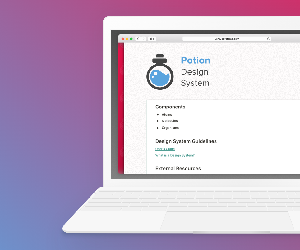
Potion Design SystemProject Overview (Versus Systems)
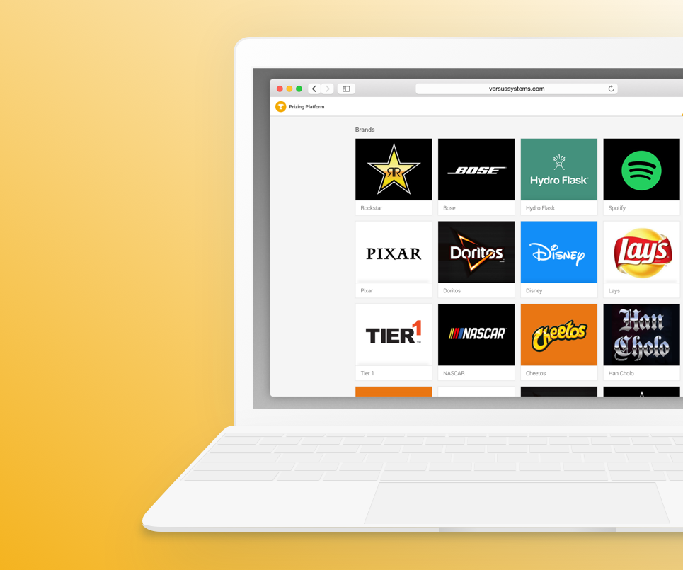
Platforms DashboardCase Study (Versus System)
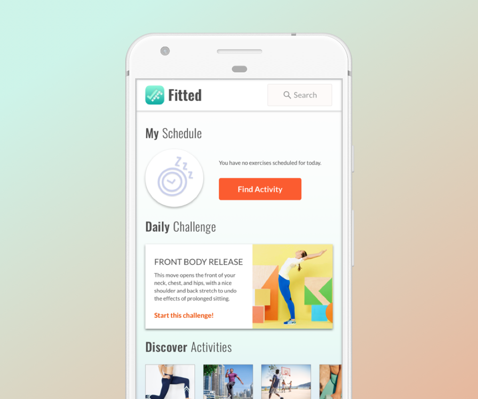
FittedCase Study (CareerFoundry)
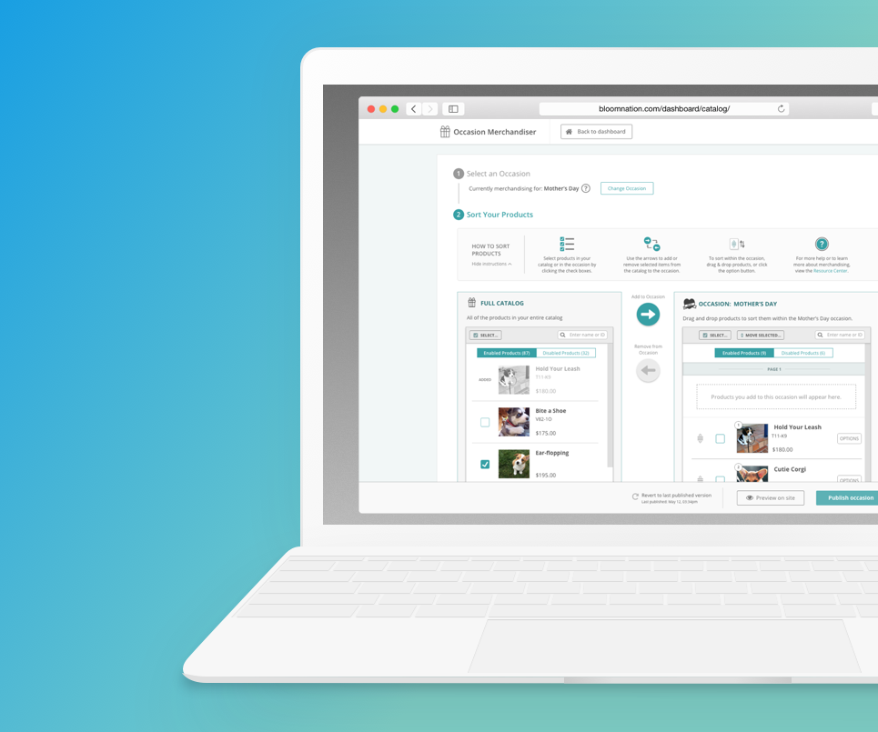
Occasion MerchandiserCase Study (BloomNation)
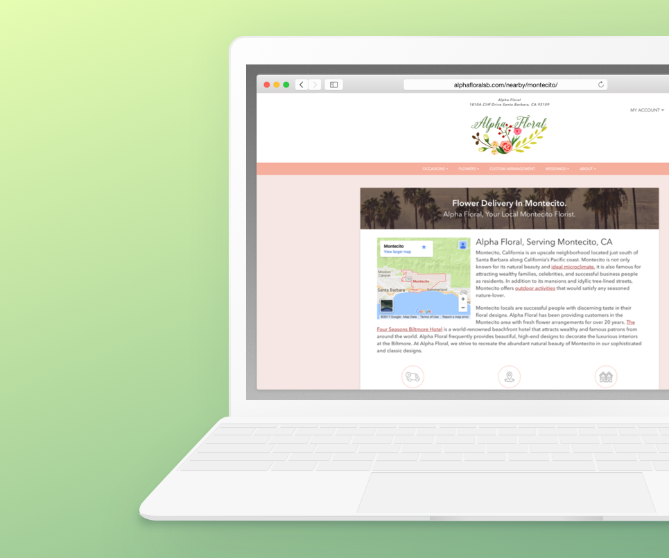
Neighborhood Local PagesCase Study (BloomNation)
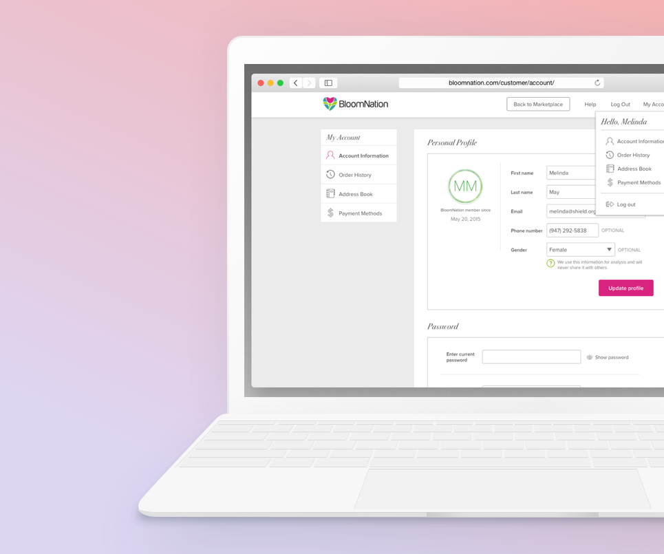
Account ManagementCase Study (BloomNation)
Document DefenseProject Overview (Rocket Lawyer)
Design & code by Tiffany Taylor Lee ⋅ © 2023 ⋅ All Rights Reserved