Neighborhood Local Pages
Neighborhood Local Pages
Neighborhood Local Pages
Landing pages meant to increase SEO rankings and conversion rates for florist websites
Landing pages meant to increase SEO rankings and conversion rates for florist websites
Landing pages meant to increase SEO rankings and conversion rates for florist websites
Project Contents
Overview
Overview
Design Challenge
Design Challenge
Design Challenge
In order to increase SEO rankings for our florists, BloomNation wanted to generate area-specific landing pages for their websites. The pages also had to work across hundreds of custom florist sites that all used different CSS to modify the visuals.
In order to allow florists to show customers the most relevant inventory on their sites, BloomNation wanted to enable its florists to merchandise (i.e. to sort) their inventory based on a specific season, holiday, or event. In addition, this would be the first tool built outside of the existing dashboard system.
Solution
Solution
Solution
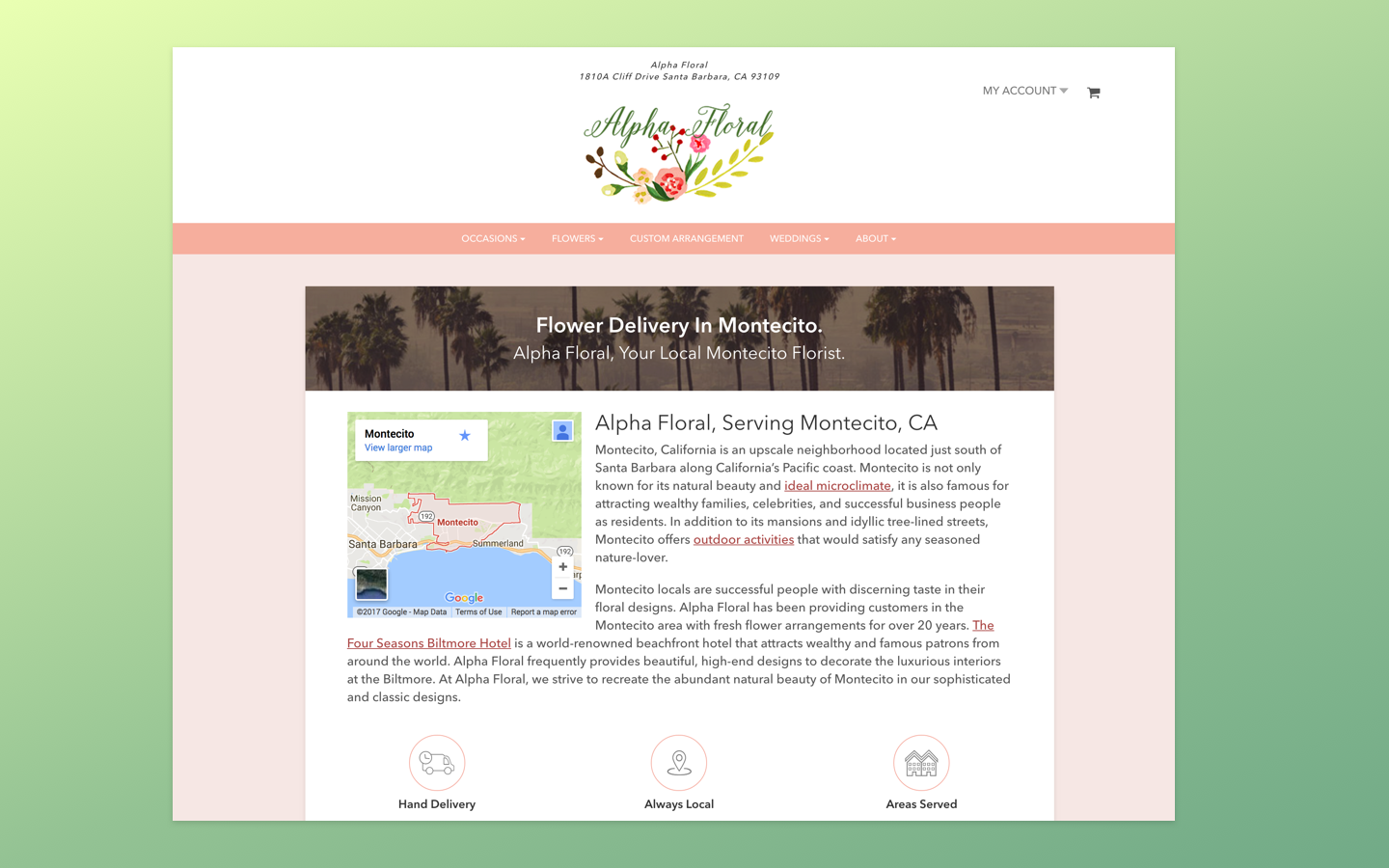
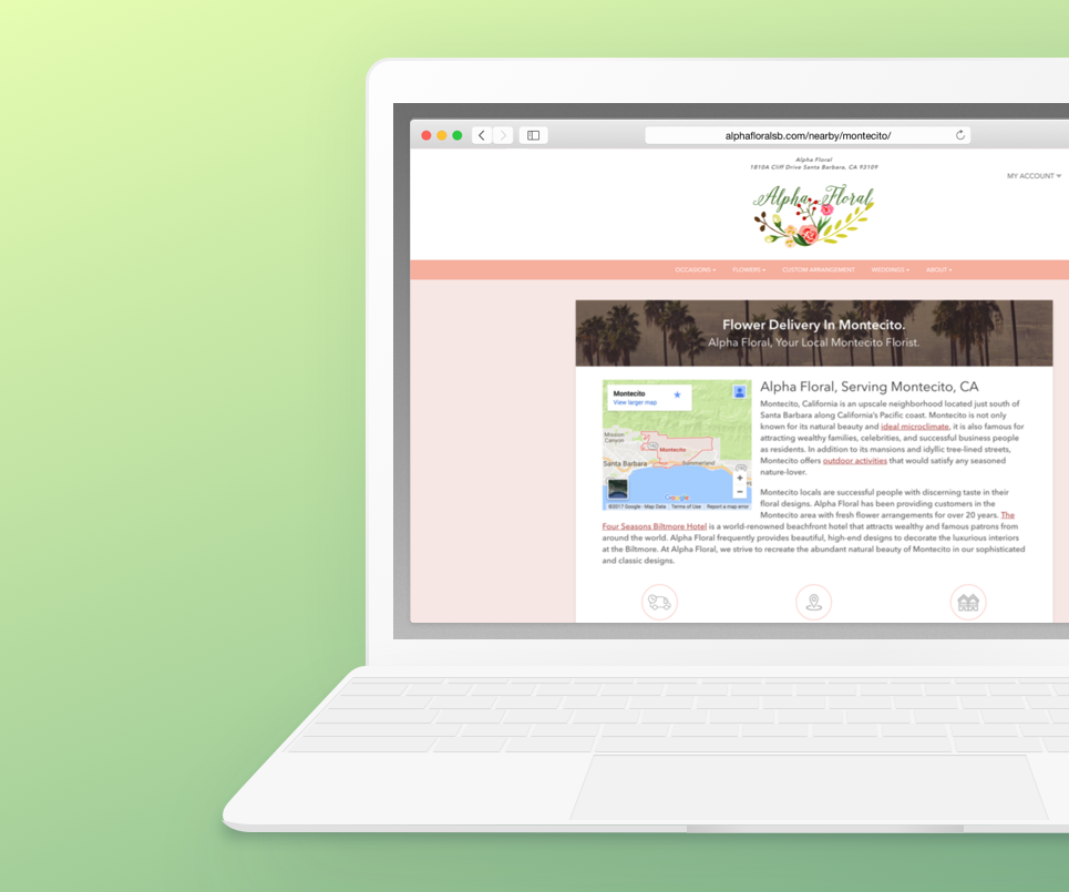
For the local pages project, I designed a framework that followed specific SEO guidelines that enhanced their ranking. These pages also provided useful local information and displayed products that encouraged users to shop and explore the site. The pages' template naturally fits with any premium site’s aesthetic and design. Also, the pages are informative and useful for the user, unlike typical SEO landing page filled with repetitive keywords.
Using user research, design intuition, and UX best practices, I designed a new tool for occasion-based merchandising. The tool enables florists to move items from their general catalog into specific occasion buckets. Once in an occasion, they can then further sort their items. They can also easily enable or disable items.
Case Study
Process
01. My Role &
Responsibilities
01. My Role & Responsibilities
01. My Role & Responsibilities
For this project I was the lead designer, working with a product manager. My responsibilities were:
- Initial comparative analysis and design research
- Designing a customisable and modular solution that increased SEO ranking
- Creating responsive designs
- Providing all required design deliverables (wireframes, high fidelity mocks, icons, photo assets, etc)
- Working with the front-end engineer to make sure that the implementation followed all of the design specs
As the lead designer for this project, I was responsible for:
- Initial comparative analysis and design research
- Collecting stakeholder feedback during design studios to inform my design decisions
- Mapping out the user journey
- Orchestrating BloomNation’s first ever user-testing sessions. Related tasks include writing a test script, moderating tests, technical setup for tests, taking notes, and preparing a findings document
- Providing all required design deliverables (wireframes, high fidelity mocks, icons, photo assets, etc)
- Pairing with the engineering team to ensure a smooth development and “design QA” process
- Working with a product manager and account managers to develop documentation for the florists
02. Research & Planning
The landing pages were first created as a quick test by the PM team without concern for the customer experience or UI; once it was determined that the pages did improve search ranking, my job was to redesign them while considering the UX.
Initially, this project planned to create several kinds of landing pages. After more thought, for the first release we scaled down to just focus on generating location-specific landing pages for the florist’s websites. I began to map out how users land on SEO pages so I could understand the mindset that a user who arrived on a SEO page may have.
03. Comparative Analysis
I also researched other industries’ landing pages. I focused on finding landing pages that were dedicated to a specific location, seeking examples that did a good job of telling a story about the place.
04. Lo-fidelity Explorations
I sketched out some layout options, but went with a direction that introduced the neighborhood and the florist’s connection to it, and then offered the some paths that would motivate the customer in browsing the site and making a purchase.
05. Hi-fidelity Designs
After reviewing the wires with the project’s stakeholders, I finalized the designs and created them in a few different florists' themes. This allowed me to highlight where the visual design variations would occur. Certain elements (like the main banner) were customizable; the internal BloomNation employee who created the page would be able to choose from a set of background photographs for the banner that accurately reflected the “mood” of the neighborhood, e.g. a beach town, a suburb, an busy city, a rural area.
In addition, the page would rely on the site’s primary and secondary colors to make sure accents were inline with the theme for each florist site. The page content is created by BloomNation copywriters, based on information provided by the florists.
06. Release
The project was released in March 2017. As expected, within a month or so, florists who requested Local Pages began to rank higher in cities and areas where they previously had a low or nonexistent ranking.
In May 2017 we had our first purchase of an arrangement from a customer who entered the site through a NLP. We now have over 250 landing pages, with more being rolled out each week.
As the lead designer for this project, I was responsible for:
- Initial comparative analysis and design research
- Collecting stakeholder feedback during design studios to inform my design decisions
- Mapping out the user journey
- Orchestrating BloomNation’s first ever user-testing sessions. Related tasks include writing a test script, moderating tests, technical setup for tests, taking notes, and preparing a findings document
- Providing all required design deliverables (wireframes, high fidelity mocks, icons, photo assets, etc)
- Pairing with the engineering team to ensure a smooth development and “design QA” process
- Working with a product manager and account managers to develop documentation for the florists
07. Reflections
This project had a few technical limitations. One example is that the florists cannot set the products that are displayed on their individual NLP. It just shows the first 4 products from their default catalog sort order. It would be nice if we could use the data we have on the florists purchases and show the top 4 best selling items. The SEO benefits are clear but I feel we can do more things like this that could increase conversion as well.
One problem that arose during this project was that many of the florists websites did not have a primary or secondary color set. Due to way the florist site's CSS framework was built, it’s not an automatic process to generate these colours. The page still works when the default primary secondary are used, but in the internal guides I would have liked to done a better job of communicating the importance of setting primary/secondary colours.
As the lead designer for this project, I was responsible for:
- Initial comparative analysis and design research
- Collecting stakeholder feedback during design studios to inform my design decisions
- Mapping out the user journey
- Orchestrating BloomNation’s first ever user-testing sessions. Related tasks include writing a test script, moderating tests, technical setup for tests, taking notes, and preparing a findings document
- Providing all required design deliverables (wireframes, high fidelity mocks, icons, photo assets, etc)
- Pairing with the engineering team to ensure a smooth development and “design QA” process
- Working with a product manager and account managers to develop documentation for the florists
Selected Works
Potion Design SystemProject Overview (Versus Systems)

Platforms DashboardCase Study (Versus System)
FittedCase Study (CareerFoundry)

Occasion MerchandiserCase Study (BloomNation)

Account ManagementCase Study (BloomNation)

Visual DesignAssorted Projects

Document DefenseProject Overview (Rocket Lawyer)
Selected Projects
Design & code by Tiffany Taylor Lee ⋅ © 2025 ⋅ All Rights Reserved
