Account Management
Account Management
Account Management
Designing an account management experience for BloomNation customers
Designing an account management experience for BloomNation customers
Project Contents
Overview
Overview
Design Challenge
Design Challenge
Design Challenge
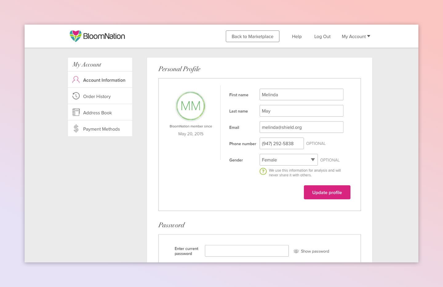
BloomNation allowed users to register or sign in, but because there were no other account management features there was no incentive for users to create accounts. In addition to offering an improved account management experience, a business reason for the project was that users who register for accounts were more likely to become repeat customers. Finally, we wanted to decrease the burden on our support team by allowing users to access their account information on their own. The team had already done much thinking and discussion around this project prior to my joining the company, but the project had stalled at the design stage.
In order to allow florists to show customers the most relevant inventory on their sites, BloomNation wanted to enable its florists to merchandise (i.e. to sort) their inventory based on a specific season, holiday, or event. In addition, this would be the first tool built outside of the existing dashboard system.
Solution
Solution
Solution
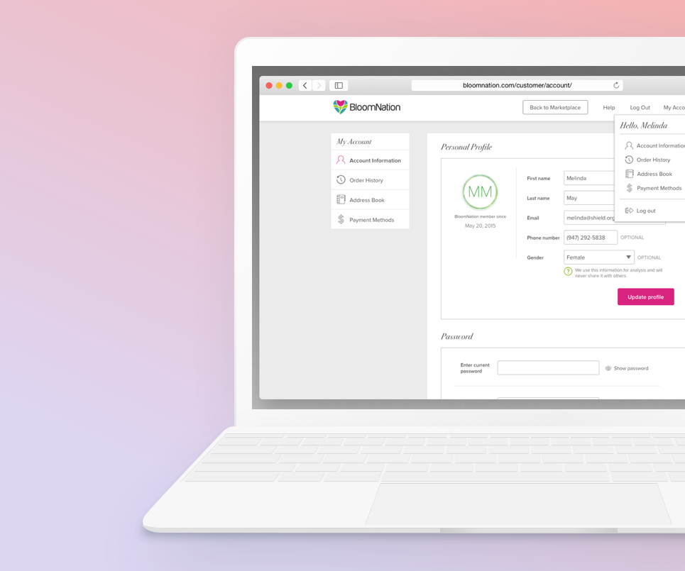
I designed an account management experience that could be built in the existing Magento framework. I mapped out the entire account management experience and provided all necessary UX guidance and UI assets to ensure we released this project quickly.
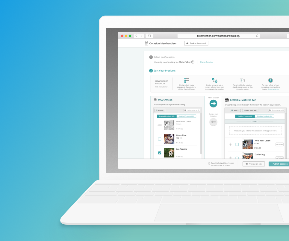
Using user research, design intuition, and UX best practices, I designed a new tool for occasion-based merchandising. The tool enables florists to move items from their general catalog into specific occasion buckets. Once in an occasion, they can then further sort their items. They can also easily enable or disable items.
Case Study
Process
01. My Role &
Responsibilities
01. My Role & Responsibilities
01. My Role & Responsibilities
As the lead designer for this project, I was responsible for:
- Consolidating previous mocks and explorations from the previous designer
- Initial comparative analysis and design research
- Mapping out the user journey
- Creating designs for both the BloomNation brand (called the Marketplace) and a template version used be used for BloomNation powered sites (called premium sites)
- Providing all required design deliverables (wireframes, high fidelity mocks, icons, photo assets, etc)
- Providing design support for post-MVP release optimizations
As the lead designer for this project, I was responsible for:
- Initial comparative analysis and design research
- Collecting stakeholder feedback during design studios to inform my design decisions
- Mapping out the user journey
- Orchestrating BloomNation’s first ever user-testing sessions. Related tasks include writing a test script, moderating tests, technical setup for tests, taking notes, and preparing a findings document
- Providing all required design deliverables (wireframes, high fidelity mocks, icons, photo assets, etc)
- Pairing with the engineering team to ensure a smooth development and “design QA” process
- Working with a product manager and account managers to develop documentation for the florists
02. Research & Analysis
I started by finding real-world examples of account management interfaces; I researched copy choices, design trends, UI patterns, and common layouts.
03. User Journey Development
I next defined the user journey and defined the touch points. This was to ensure the team collectively understood which backend systems the users interacted with and when those interactions would occur. This also helped us outline what the user could and couldn’t do in the initial MVP (minimum viable product) release, referred to internally as Phase 1.
04. Explorations & Sketches
Mobile and desktop lo-fi design explorations were next. As I designed I had to keep in mind that account management would be released on BloomNation's main marketplace as well as across hundreds of custom “premium sites” for florists; whatever solution I came up with had to work for both.
05. Lo-fidelity Wireframes
After reviewing my sketches with the team, I rendered the designs in a lo-fidelity wireframe to start fleshing out the full experience. I also built a prototype in Invision to share with the team.
One of the challenges I faced was how to incorporate account management into the premium site design framework. Premium sites all had the same HTML/CSS framework, but most heavily relied on custom CSS to modify their individual interfaces and visual designs. As a result of all of this custom CSS, I had to keep in mind that any major structure changes that I proposed would likely break across hundreds of sites—it would greatly impact the success of the release and implementation.
06. Hi-fidelity Mocks (Desktop)
Using the project stakeholders’ feedback on the lo-fi prototypes to inform my decisions, I continued on to finish the high-fidelity mocks. I worked with engineering to answer any questions and ensure the project was implemented as designed.
For premium sites, I modified the existing the shopping cart area in the template and added an account dropdown link. I also instructed that we add the ability to set and use primary/secondary theme colors in premium sites. This allowed us to use CSS to make the new account management feature, as well as any future projects, feel natural no matter the premium site’s visual design.
07. Hi-fidelity Mocks (Mobile)
Prior to the account management project, BloomNation’s mobile site relied on a hamburger menu for navigation. I opted to redesign the site header, using a tabbed navigation instead of hiding the navigation options.
For mobile, the premium sites all use the same template. It only has color variations, so adding the account links to the existing mobile menu was an easy decision to make.
Visual Design
01. Style Guide Creation
Because BloomNation did not have any design documentation, I took this opportunity to start building a design system. In order to bring visual cohesion to the BloomNation experience, I started with a style guide to define styling and usage for form fields, buttons, icons, etc.
02. Iconography
This project allowed me to transition off of the free icon set BloomNation had been using and create icons that were modern and cohesive. I also started to transition BloomNation to using scalable images during this project, providing all assets as SVG. I designed nearly all of the assets in Account Management, with the exception being many of the occasion icons and some illustrations; some of the specific occasion icons were from an icon set and some of the illustrations were previously created for email marketing campaigns by our graphic designer.
03. Hi-fidelity Mocks
Release
01. Metrics & Feedback
Prior to account management, the conversation rate on the marketplace from November to December 2016 was around 2.6%. Following the release*, the conversion rate increased to 3.02%, for an increase of 0.42%. For premium sites, I included a link to an optional user feedback survey. So far, all of the responses to the survey have been positive.
* In order to omit Valentine’s Day, when traffic is usually high, and other UX improvements, this number was generated by tracking conversion rates from February 20 to May 1.
As the lead designer for this project, I was responsible for:
- Initial comparative analysis and design research
- Collecting stakeholder feedback during design studios to inform my design decisions
- Mapping out the user journey
- Orchestrating BloomNation’s first ever user-testing sessions. Related tasks include writing a test script, moderating tests, technical setup for tests, taking notes, and preparing a findings document
- Providing all required design deliverables (wireframes, high fidelity mocks, icons, photo assets, etc)
- Pairing with the engineering team to ensure a smooth development and “design QA” process
- Working with a product manager and account managers to develop documentation for the florists
02. Future Considerations
There were several features that didn’t make it into phase 1 release, like the ability to easily reorder from the order details page or to leave/edit a review. The design work for these features was started but was paused once it was decided they would not be included in the phase 1 release. In retrospect, I would have pushed for that feature to be planned for release rather than being indefinitely paused.
In addition, this was my first project at BloomNation. Learning how to work with a new dev team always has a few challenges, and looking back I would have done a better job of checking in with the front-end developer during the implementation phase.
In an effort to release account management quickly, there was not as much time for “design QA” as I usually like to have. The minor UI bugs were eventually fixed, but I learned that I need to make sure I continue my check-ins with the front-end team throughout the implementation phase. That lesson has proved useful in future projects.
As the lead designer for this project, I was responsible for:
- Initial comparative analysis and design research
- Collecting stakeholder feedback during design studios to inform my design decisions
- Mapping out the user journey
- Orchestrating BloomNation’s first ever user-testing sessions. Related tasks include writing a test script, moderating tests, technical setup for tests, taking notes, and preparing a findings document
- Providing all required design deliverables (wireframes, high fidelity mocks, icons, photo assets, etc)
- Pairing with the engineering team to ensure a smooth development and “design QA” process
- Working with a product manager and account managers to develop documentation for the florists
Selected Works
Potion Design SystemProject Overview (Versus Systems)

Platforms DashboardCase Study (Versus System)
FittedCase Study (CareerFoundry)

Occasion MerchandiserCase Study (BloomNation)

Neighborhood Local PagesCase Study (BloomNation)

Visual DesignAssorted Projects

Document DefenseProject Overview (Rocket Lawyer)
Selected Projects
Design & code by Tiffany Taylor Lee ⋅ © 2025 ⋅ All Rights Reserved
